#EuropeanOrganicModern: New Home Tour Entry Reaveal!
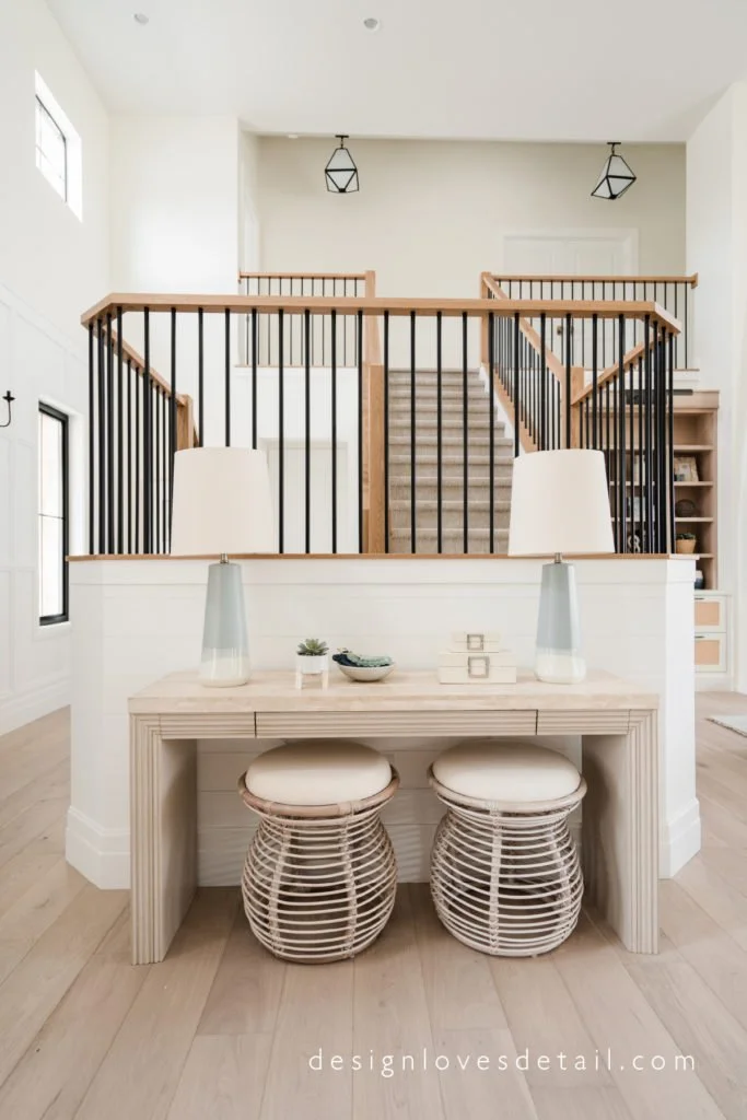
Entry styling. Love this console table set up! See the Home Tour with product links included
European Organic Modern Entry
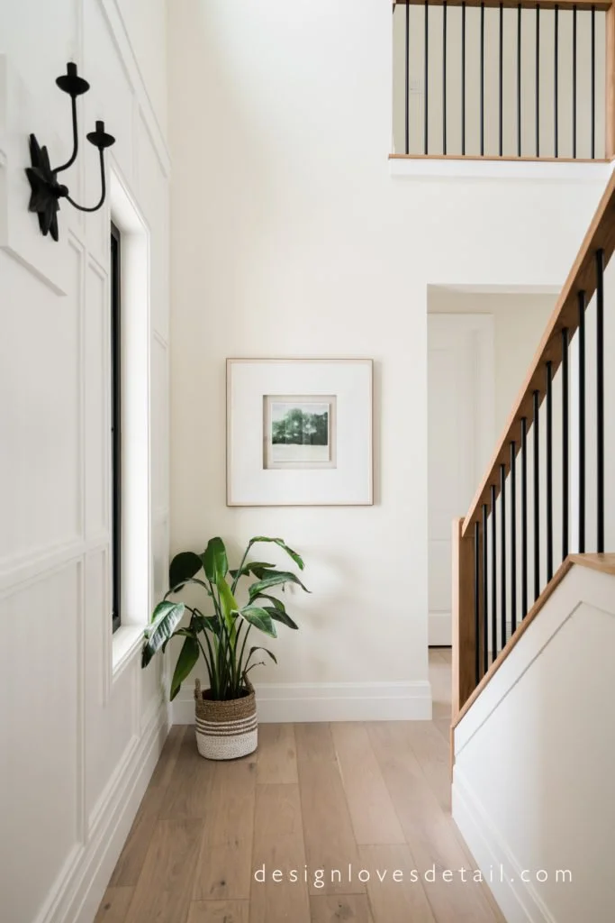
Obsessed with this beautiful entry! Love those sconces! Plus the door color... amazing!
European Organic Modern Entry with metal and white oak railing
Love this creative custom entry design with tall ceilings and lots of natural light!
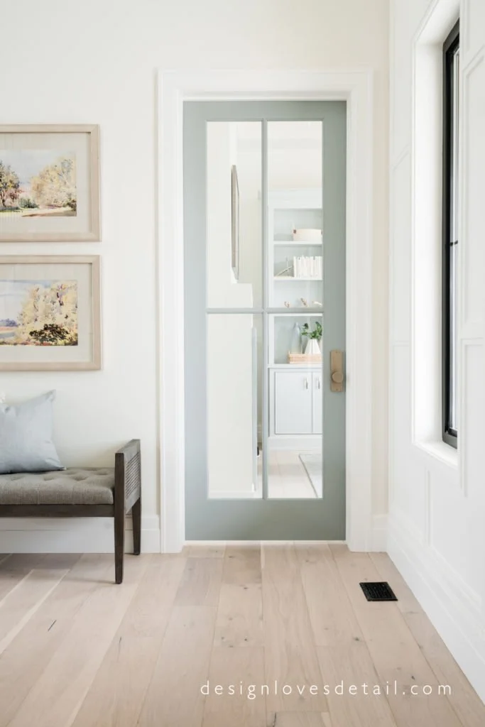
Love this entry! Check out the full home tour. That door and paint color are amazing!!
European Organic Modern Entry with Product Links Incldued
Emtek Tumbled White Bronze Door Knobs. Love the champagne tone and more raw finish!
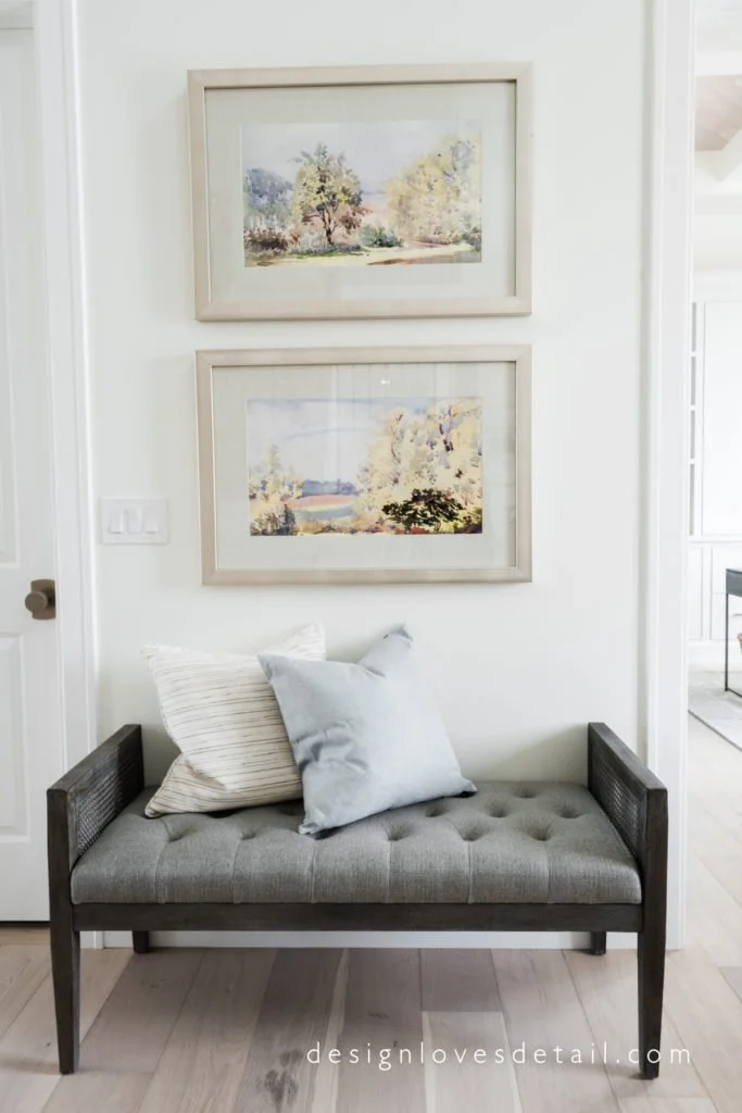
It's been years in the making, but here we are finally ready to reveal the first little piece of this creation-- the entry space. Lots of details went into making this aspect of my new home. I wanted to bring in some molding, but in a cost effective way. I designed this layered grid trim that surrounds the front doors and goes half way up the wall. I think it blends the modern organic and traditional European styles quite well. Simple white ship lap wraps around the stairs and around the inside of the door alcove. To accent the molding I opted for sconces rather than the typical entry chandelier. I love the simple, yet whimsical touch they add.The walls are a warm white, one of my favorites-- Benjamin Moore's Swiss Coffee and the trim is Benjamin Moore's Super White. The doors are Boothbay Gray (can't get enough of this color!) also from Benjamin Moore. These subtle tones create the backdrop for this space that's layered with textures and airy colors. I wanted to play with the use of warm and cool tones together and love the outcome. The wood flooring is the element that grounds the space (literally and figuratively, haha) and provides the perfect amount of warmth. It's by Hallmark Floors, from the Ventura Collection and the color is Seashell. I wanted something with a more raw look, matte finish and with some variation in tone to keep it natural and interesting. One thing I also aimed to achieve with this house is a more timeless feel. I wanted to select elements that felt less trendy to keep the house from feeling dated down the road. A key to doing this is finding a style that truly suits YOU. For me, I put together my favorite things... European undertones, organic elements & modern design. That's how I came up with #EuropeanOrganicModern. I'll be going into more detail on this as we go through the different spaces in my home.Another element I've been getting a lot of questions on already (from my instagram stories last week), is the door hardware. The Emtek knobs and handles I used throughout my home are the Tumbled White Bronze finish, which has a raw natural look to it as well-- this organic style is part of how I accomplished the more timeless feel-- natural elements are part of what I think give a timeless, high quality style that can stand the test of time. The Tumbled White Bronze finish has gold undertones, but is what I'd describe as an overall "champagne" tone, which lends itself well to brass finishes as well as nickel tones. I'll share more about this when we tour the kitchen! I've included a close up for those of you requesting more details on this finish. It's honestly my favorite!Also, this is the 3rd home we've built with Clearstone Builders and we love Spencer more than ever for making all my dreams reality! I'll be sharing more about him and also the custom build process as we go through the home reveal! More coming next week. Happy Weekend!** Furniture/Accent/Finishes sources are included at bottom of post **images captured by Travis J PhotographyConsole TableStools Under TableLampsWall SconcesEntry BenchFlooringRound RugFaux SucculentMarble BowlDecor Beads


